
Car Emblems And Names are more than just branding; they are a visual representation of a car manufacturer’s history, values, and aspirations. Automotive brands invest significant thought and design expertise into these icons, aiming for instant recognition and a lasting impression. While many car logos are familiar, the stories behind them are often intriguing and deeply rooted in history, mythology, and the personal journeys of the founders. From family crest inspirations to nods to celestial bodies and engineering tools, let’s delve into the fascinating world of car emblems and names and uncover the hidden meanings they carry.
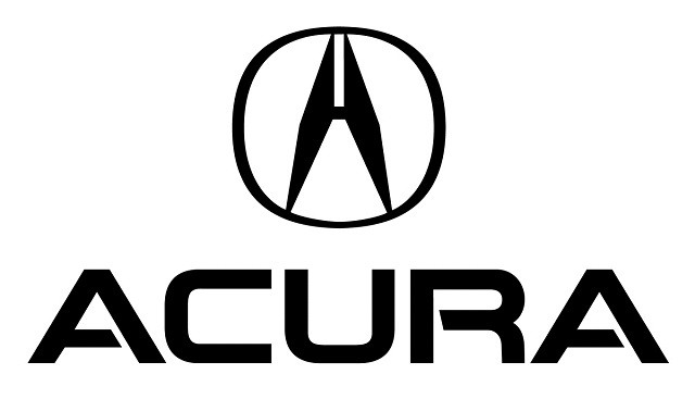
Acura
Initially perceived as a stylized “A,” the Acura logo also sparks interpretations of an “H,” hinting at its parent company, Honda. However, Acura clarifies that the emblem is not alphabetical but rather a caliper, a tool used in engineering for precise measurement of thickness. This explanation aligns with the name “Acura,” derived from the Latin word “acu,” signifying “precision” or “mechanically precise.” Thus, the Acura car emblem visually embodies the brand’s commitment to engineering excellence and meticulous detail.
Alfa Romeo
Perhaps one of the most distinctive and elaborate car brand logos, Alfa Romeo’s emblem is rich in symbolism. It merges icons representing Milan, the brand’s birthplace, and the House of Visconti, a prominent Milanese ruling family from the Middle Ages. The Milanese cross, dating back to the Crusades and featured in Milan’s coat of arms, signifies the city’s historical military presence. The biscione, or “large snake,” a key figure in Milanese history adopted by the Visconti family, adds another layer of heritage. The figure emerging from the serpent’s mouth is interpreted as a symbol of rebirth, while the crown atop the emblem denotes Alfa Romeo’s prestigious world racing championship victories. The Alfa Romeo car emblem is a powerful visual tapestry of history and achievement.
Audi
The Audi car emblem, characterized by its interlocking four rings, straightforwardly represents the amalgamation of four independent German automobile manufacturers: Audi, DKW, Horch, and Wanderer. These companies merged to form what is now Audi, and the logo serves as a visual reminder of this union and the collective history of these pioneering brands.
The Audi name itself also has an interesting origin story. August Horch, an automotive engineer, founded Horch & Cie in 1899. Following disagreements with the board, he departed and established a new car company. However, “Horch” remained a trademarked name. Seeking a new moniker, the son of one of Horch’s business partners proposed “Audi,” the Latin translation of “Horch.” In German, “Horch” means “hark” or “hear,” while in Latin, “Audi” translates to “listen.” The Audi name, therefore, is a clever play on words and a continuation of the founder’s legacy.
BMW
The BMW logo, featuring blue and white quadrants, is often mistakenly associated with spinning propellers against a blue sky, a popular myth linked to BMW’s early history as an aircraft engine manufacturer in the early 20th century. While captivating, this isn’t the logo’s original intent. The BMW logo’s design is rooted in the logo of Rapp Motorenwerke, the company from which BMW emerged. The Rapp Motorenwerke logo was circular with “Rapp Motor” inscribed around the perimeter. BMW replaced the text with its own name and incorporated the blue and white colors of Bavaria, BMW’s home state, as an homage.
Despite not being the logo’s origin, the propeller interpretation gained traction, possibly fueled by a 1929 advertisement promoting a new BMW aircraft engine that depicted an airplane with the BMW logo within a rotating propeller. BMW has, to some extent, embraced this myth over time. Fred Jakobs of BMW Group Classic noted that BMW didn’t actively correct the propeller myth for a long time, and after 90 years, it has become a somewhat accepted interpretation, adding an interesting layer to the BMW brand narrative.
Buick
The Buick car logo, characterized by its tri-shield design, draws inspiration from the ancestral coat of arms of David Dunbar Buick’s family, the company’s founder. In the 1930s, a designer researching Buick family history discovered a description of the family’s coat of arms in an old heraldry book at the Detroit Public Library. Buick’s family originated from Scotland, and although the book lacked an illustration, it described a red shield bisected by a checkered line from the upper-left to the lower-right corners. This heraldic description became the foundation for the iconic Buick tri-shield logo, representing the brand’s heritage and connection to its founder’s lineage.
Cadillac
Cadillac, named after Antoine de la Mothe Cadillac, the founder of Detroit, pays tribute to the French explorer through both its name and its logo. The Cadillac car emblem is largely based on Cadillac’s family crest, honoring his legacy. Historically, the logo featured stylized birds resembling ducks, which are actually merlettes, mythical creatures often used in heraldry as knight symbols. Their presence in groups of three was interpreted to represent the Holy Trinity. While the Cadillac logo has evolved over the years, it continues to carry the essence of its historical inspiration and the prestige associated with the Cadillac name.
Chevrolet
The Chevrolet bowtie, a ubiquitous car brand logo, has a surprisingly unclear origin story. At least four different accounts exist regarding the emblem’s creation. Chevrolet co-founder William C. Durant introduced the logo in 1913, claiming its inspiration came from a wallpaper design he encountered in a Paris hotel room. His daughter Margery later recalled her father doodling nameplate designs during dinner. Durant’s widow, Catherine, offered another version, stating the logo was inspired by a design in a newspaper advertisement. A final theory suggests the bowtie is a stylized rendition of the Swiss flag cross, a nod to Louis Chevrolet, Durant’s partner and the company’s namesake, who was born in Switzerland. This ambiguity surrounding the Chevy bowtie’s origin adds to its iconic and intriguing nature.
Ferrari
Enzo Ferrari adopted the prancing black horse for his racing cars as a tribute to Francesco Baracca, an Italian World War I flying ace and national hero, whose plane bore the same emblem. Years after Baracca’s death, his parents requested Ferrari to use the prancing horse, believing it would bring him luck. The canary yellow background, the city color of Modena, Italy, Ferrari’s hometown, completes the logo. The Ferrari car emblem, therefore, is a powerful symbol of speed, national pride, and the brand’s deep-rooted racing heritage.
Hyundai
While appearing as a stylized “H,” the Hyundai car logo is designed to represent two figures shaking hands – symbolizing the company and the customer. Hyundai states that this visual representation embodies their promise and commitment to customer satisfaction and strong relationships. The logo goes beyond a simple initial, conveying a deeper message of partnership and trust.
Infiniti
Infiniti, Nissan’s luxury vehicle division, designed its logo to depict two central lines extending towards the horizon, symbolizing an “endless road forward” and the brand’s pursuit of progress and limitless possibilities. Alternative interpretations suggest the logo represents Mount Fuji, referencing Nissan’s Japanese origins, or a lemniscate, the mathematical symbol for infinity. These multiple layers of interpretation add depth and intrigue to the Infiniti car emblem, reflecting the brand’s luxury and forward-thinking ethos.
Lamborghini
The Lamborghini car logo, featuring a bull, is directly linked to founder Ferruccio Lamborghini’s personal interests. He was passionate about bullfighting, and his zodiac sign was Taurus, the bull. The choice of a bull logo was therefore a natural fit, representing power, strength, and a forceful presence. The color scheme, however, is said to be a deliberate contrast to Ferrari. Legend has it that Lamborghini chose an inverse color scheme to Ferrari’s – a gold bull on a black background, while Ferrari features a black horse on a yellow background – as a subtle way to challenge his competitor.
Maserati
The Maserati car logo, featuring a trident, stands out for its longevity and near-unchanged design since the company’s inception. Around 1920, seeking a distinctive logo, the Maserati family commissioned artist Mario Maserati, the sixth brother and the only one not involved in engineering. Mario drew inspiration from the Fountain of Neptune in Bologna’s Piazza Maggiore, where the Maserati brothers established their company. The statue of Neptune holding a trident, a symbol of strength and vigor, became the logo’s central motif. The red and blue colors are derived from the Bologna banner. Maserati states that the trident logo “underlines the exclusive status of the firm’s cars and their identity as masterpieces of elegance, luxury and sports-car performance.”
Mazda
Mazda has used various logos since the 1930s. The current Mazda car logo, introduced in 1998 with a minor update in 2015, features stylized V-shaped wings inside an oval, collectively forming the letter “M.” According to Mazda, the wings symbolize the company’s “determination to pursue ongoing improvements to drive powerful, continuous growth” in the automotive market. The logo represents Mazda’s forward-thinking approach and commitment to innovation.
Mercedes-Benz
The iconic three-pointed star of the Mercedes-Benz car logo originated from a postcard. Gottlieb Daimler, a co-founder, used the symbol to mark his family’s house on a postcard depicting Deutz, the town where he worked as technical director of Gasmotorenfabrik Deutz. After Daimler’s death, his sons, Paul and Adolf Daimler, adopted the three-pointed star as the brand logo. Mercedes-Benz later stated that the logo represents the company’s ambition of “universal motorization on land, air and sea,” reflecting Daimler’s pioneering vision and the brand’s broad scope.
Mitsubishi
The name “Mitsubishi” itself provides insight into the car brand logo. It’s a combination of two Japanese words: “mitsu,” meaning “three,” and “hishi,” meaning water chestnut, which has long been used in Japan to refer to a diamond shape. Mitsubishi founder Yataro Iwasaki chose the three-diamond symbol as a combination of two family crests: the three-leaf crest of his first employer, the Tosa Clan, and his family’s crest of three stacked rhombuses. The Mitsubishi car emblem, therefore, visually represents its name and honors the founder’s heritage and origins.
Porsche
The Porsche car logo is a composite of heraldic symbols representing the German state of Württemberg and its capital city, Stuttgart, where Porsche’s headquarters are located. The horse in the logo is derived from Stuttgart’s coat of arms, while the antlers and red and black stripes are adopted from the crest of the Kingdom of Württemberg. The Porsche logo is a strong visual declaration of its German heritage and regional pride.
Ram
The Ram’s head logo, now synonymous with Ram trucks, originally debuted in the 1930s as a hood ornament on all Dodge vehicles. Sculptor Avard T. Fairbanks designed the ornament to symbolize vehicles that were “swift, strong, sure, and proud.” After experimenting with various animal designs, including a lion, tiger, and jaguar, Fairbanks presented a leaping ram to Walter P. Chrysler and other executives. He chose the ram because “It’s sure footed; it’s the king of the trail; and it won’t be challenged by anything.” Eventually, the Ram name was adopted for Dodge’s line of trucks, and the Ram’s head became the exclusive car emblem for this brand, embodying its rugged and capable identity.
Subaru
The Subaru car logo is a direct reference to the Pleiades star cluster, a prominent group of stars in the constellation Taurus. “Subaru” is the Japanese name for the Pleiades cluster. This celestial connection is further deepened by the logo’s meaning: it represents the merger of five smaller companies that formed Subaru’s parent company, Fuji Heavy Industries (FHI). The large star in the logo symbolizes FHI, and the five smaller stars represent the five merged companies, visually depicting unity and collaboration under the Subaru name.
Tesla
The Tesla car logo, a stylized “T,” is not just a sleek initial. It cleverly represents a cross-section of an electric motor, subtly highlighting Tesla’s core technology and focus on electric vehicles. This design element underscores the brand’s commitment to innovation and electric mobility, embedding its technological identity within its emblem.
Toyota
The Toyota car logo comprises three overlapping ellipses. Two of these ellipses intersect to form the letter “T,” for Toyota. According to the manufacturer, these ellipses “symbolize the unification of the hearts of our customers and the heart of Toyota products.” This interpretation emphasizes the strong relationship Toyota aims to build with its customers and the interconnectedness of the brand with its global customer base. The interlocking ellipses also represent Toyota’s global reach and presence in the automotive market.
Volvo
Volvo’s origins as a ball bearing manufacturer are reflected in its name. “Volvere” in Latin means “to roll,” and “volvo” translates to “I roll.” When Volvo ventured into car manufacturing, it adopted the ancient symbol for iron, a circle with an arrow pointing diagonally upwards to the right, as its car logo. This symbol was originally used to represent Mars, the Roman god of warfare, due to the early connection between Mars and iron, the primary material for weapons. For Volvo, this adapted logo symbolizes steel and strength, embodying core brand values such as safety, quality, and durability. The Volvo car emblem is a powerful and historically resonant representation of these principles.
Car emblems and names are far from arbitrary choices. They are carefully crafted symbols carrying rich histories, brand values, and sometimes, hidden meanings. Understanding these stories adds another layer of appreciation for the vehicles we see every day and the brands behind them. From historical crests to modern interpretations of company values, car logos and names are a fascinating aspect of automotive branding and design.