
Car logos and names are more than just marketing; they are carefully crafted symbols that tell a story about a brand’s heritage, values, and aspirations. From iconic emblems to stylized lettering, these visual and verbal cues are designed to resonate with consumers and forge a lasting impression. Let’s embark on a journey to explore the fascinating world of Car Symbols And Names, uncovering the hidden meanings and historical roots behind some of the most recognizable automotive brands.
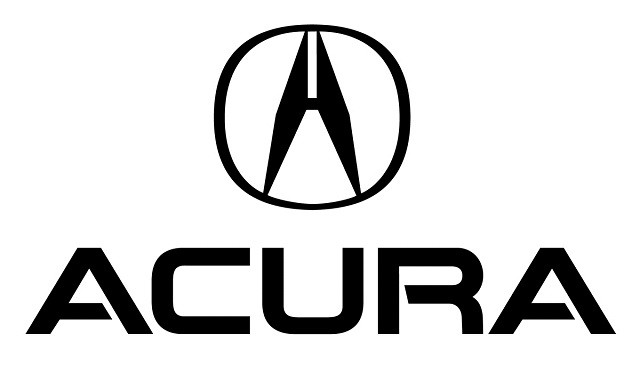
Acura: Precision in Every Caliper
The Acura logo, often mistaken for a stylized “A” or even an “H” (given its parent company Honda), is actually a representation of a caliper. This precision instrument, used for measuring thickness in engineering and science, perfectly embodies the Acura name. Derived from the Latin word “acu,” meaning “precise” or “done with precision,” Acura signifies mechanical accuracy and high performance. The logo visually communicates the brand’s commitment to engineering excellence and meticulous detail.
Alfa Romeo: Milanese Heritage and Rebirth
The Alfa Romeo logo stands out as one of the most intricate and historically rich emblems in the automotive world. It’s a vibrant tapestry of symbols representing Milan, the city where Alfa Romeo was born, and the influential House of Visconti, a prominent Milanese ruling family during the Middle Ages.
The red cross on a white field is the Cross of Milan, a symbol dating back to the Crusades, proudly worn by Milanese soldiers and a key element in the city’s coat of arms. Juxtaposed with this is the “biscione,” a large serpent, a significant heraldic emblem of the Visconti family and Milanese history. The figure emerging from the serpent’s mouth is often interpreted as a man being reborn, symbolizing renewal and perhaps Alfa Romeo’s constant innovation. The crown above traditionally signifies Alfa Romeo’s early success and prestige in world racing championships. Together, these elements weave a compelling narrative of heritage, power, and rebirth.
Audi: Four Rings of Unity
The Audi logo, composed of four interlocking rings, is a straightforward yet powerful symbol of unity. Each ring represents one of the four independent automobile manufacturers – Audi, DKW, Horch, and Wanderer – that merged in 1932 to form Auto Union, which later became Audi. This visual representation clearly communicates the brand’s foundation built on collaboration and the combined strengths of these pioneering companies.
The name “Audi” itself also has an interesting origin story tied to its founder, August Horch. After leaving his first car company, Horch & Cie, due to disagreements, he needed a new name for his next venture. However, “Horch” was still trademarked by his former company. In a clever twist, the son of one of Horch’s business partners suggested using the Latin translation of “Horch.” In German, “Horch” means “hark” or “hear,” while in Latin, “Audi” means “to listen.” Thus, Audi was born, a name that resonated with innovation and a forward-thinking approach.
BMW: Bavarian Roots, Not Propellers
The BMW logo, with its iconic blue and white quadrants, is often mistakenly associated with spinning propellers against a blue sky, a nod to BMW’s early history as an aircraft engine manufacturer. However, BMW clarifies that this isn’t the original intention. The logo’s design actually originates from the Rapp Motorenwerke company, from which BMW emerged. Rapp Motorenwerke’s logo was circular with “Rapp Motor” inscribed around the edge. BMW retained the circular shape, replaced the text with “BMW,” and, as a tribute to its Bavarian homeland, filled the quadrants with the Bavarian colors of blue and white.
The propeller myth, while not historically accurate as the logo’s origin, might have gained traction from a 1929 BMW advertisement promoting a new aircraft engine. The ad depicted an airplane with the BMW logo visually integrated into a rotating propeller. Interestingly, BMW has, to some extent, embraced this popular interpretation over time, acknowledging its widespread acceptance and symbolic resonance with the brand’s history and dynamism.
Buick: A Family Crest on the Road
The Buick tri-shield logo is a direct tribute to the ancestral coat of arms of David Dunbar Buick, the founder of the Buick Motor Company. In the 1930s, a designer researching Buick’s family history at the Detroit Public Library unearthed a description of the family crest in an old heraldry book. The description detailed a red shield bisected diagonally by a checkered line, reflecting Buick’s Scottish roots. While the book lacked a visual illustration, this description became the foundation for Buick’s enduring tri-shield emblem, a symbol of heritage and established lineage.
Cadillac: Honoring Detroit’s Founder
Cadillac, named after Antoine de la Mothe Cadillac, the founder of Detroit, pays homage to this French explorer not only through its name but also through its logo. The Cadillac crest is loosely based on Antoine de la Mothe Cadillac’s family coat of arms, reflecting a sense of nobility and historical prestige.
For many years, the Cadillac logo famously featured stylized birds, often jokingly referred to as “ducks.” These were actually merlettes, mythical birds used in heraldry, often symbolizing knights and appearing in groups of three to represent the Holy Trinity. While the logo has evolved over time, its roots remain deeply connected to Cadillac’s namesake and a legacy of luxury and grandeur.
Ferrari: The Prancing Horse of Courage
The iconic prancing black horse of Ferrari is steeped in history and heroism. Enzo Ferrari adopted this emblem from the personal plane of Francesco Baracca, an Italian World War I flying ace and national hero. Baracca himself had the prancing horse painted on his aircraft for good luck. Years after Baracca’s death, his parents suggested to Enzo Ferrari that he use the same symbol, believing it would bring him similar fortune in racing. The canary yellow background, the city color of Ferrari’s hometown Modena, Italy, completes this powerful and instantly recognizable logo, embodying speed, prestige, and Italian pride.
Hyundai: A Handshake of Trust
The Hyundai logo, a stylized “H,” goes beyond simple initial representation. It is designed to visually depict two figures shaking hands – symbolizing the company and the customer in a gesture of mutual trust and agreement. Hyundai states that this logo embodies their promise and commitment to their customers, signifying a strong partnership and customer-centric approach. The slanted “H” also suggests dynamism and forward movement, aligning with Hyundai’s growth and ambition.
Infiniti: Endless Horizon of Luxury
Infiniti, Nissan’s luxury division, designed its logo to represent “infinite possibilities” and a forward-looking vision. The emblem, featuring two central lines converging towards a vanishing point on the horizon, symbolizes an “endless road ahead,” representing continuous progress and a journey into the future of luxury. Interpretations also link the logo to a stylized Mount Fuji, subtly nodding to Nissan’s Japanese heritage, or to a lemniscate, the mathematical symbol for infinity, further reinforcing the theme of limitlessness and boundless potential.
Lamborghini: Bullish Power and Provocation
The Lamborghini logo, a charging bull, is directly inspired by the founder Ferruccio Lamborghini’s passion for bullfighting and his zodiac sign, Taurus. The bull embodies power, strength, and aggression, reflecting Lamborghini’s high-performance and assertive brand image.
The color story behind the logo adds another layer of intrigue. Legend has it that Lamborghini deliberately chose an inverted color scheme compared to Ferrari’s logo – a gold bull on a black background versus Ferrari’s black horse on gold. This is believed to be a playful jab and a symbolic challenge to its main competitor, adding a touch of rivalry and bravado to the Lamborghini brand identity.
Maserati: Trident of Neptune, Bologna’s Pride
The Maserati logo, the trident, is a symbol of enduring legacy, remaining virtually unchanged since the company’s inception nearly a century ago. Around 1920, the Maserati brothers sought a distinctive logo to set their cars apart. They turned to their artist brother, Mario Maserati, the only brother uninterested in engines, for creative inspiration.
Mario drew inspiration from the Fountain of Neptune in Bologna’s Piazza Maggiore, where the Maserati brothers established their company. The statue of Neptune wielding a trident, a symbol of strength and dominion over the seas, resonated deeply. The trident logo was thus born, instantly conveying power and prestige. The red and blue colors, taken from the banner of Bologna, further solidify the logo’s connection to its origin city and Italian heritage. Maserati emphasizes that the trident logo “underlines the exclusive status of the firm’s cars and their identity as masterpieces of elegance, luxury and sports-car performance.”
Mazda: Wings of Continuous Growth
Mazda has evolved through several logo iterations since the 1930s. The current logo, introduced in 1998 and slightly refined in 2015, features a stylized “M” formed by a pair of V-shaped wings enclosed within an oval. According to Mazda, these wings represent the company’s “determination to pursue ongoing improvements to drive powerful, continuous growth.” The logo embodies Mazda’s dynamic spirit, ambition, and commitment to constant evolution in the automotive industry.
Mercedes-Benz: Star of Land, Sea, and Air
The iconic three-pointed star of Mercedes-Benz has a fascinating origin rooted in personal correspondence. Gottlieb Daimler, one of the co-founders, first used the three-pointed star to mark his family’s house on a postcard depicting the town of Deutz, where he worked as technical director of Gasmotorenfabrik Deutz. After Daimler’s death, his sons, Paul and Adolf Daimler, adopted the three-pointed star as the brand logo, linking it to their father’s vision.
Mercedes-Benz later officially stated that the three-pointed star symbolizes the company’s ambition of “universal motorization” – on land, air, and sea. This powerful symbol represents Mercedes-Benz’s pioneering spirit and its commitment to engineering excellence across all domains of mobility.
Mitsubishi: Three Diamonds of Heritage
The name “Mitsubishi” itself provides a clue to the logo’s meaning. It’s a combination of two Japanese words: “mitsu,” meaning “three,” and “hishi,” which translates to “water chestnut,” but is also used in Japanese to denote a diamond shape due to the water chestnut’s diamond-shaped leaves.
Mitsubishi founder Yataro Iwasaki chose this symbol, the three diamonds, by drawing inspiration from two family crests. One was the three-leaf crest of his first employer, the Tosa Clan, and the other was his own family crest, which featured three stacked rhombuses. The Mitsubishi logo, therefore, represents a blend of heritage, loyalty, and the enduring strength symbolized by the diamond shape.
Porsche: Stuttgart’s Stallion and Württemberg’s Crest
The Porsche logo is a rich tapestry of regional pride and historical symbolism, directly incorporating elements from the coat of arms of the former German state of Württemberg and its capital city, Stuttgart, where Porsche’s headquarters are located.
The prominent black horse rearing up in the center is taken directly from the coat of arms of Stuttgart, representing the city’s historical association with horses and equestrian culture. Surrounding the horse are elements from the crest of the Kingdom of Württemberg – the antlers and the red and black stripes. The Porsche logo, therefore, is a powerful declaration of its regional roots and a tribute to the heritage of Stuttgart and Württemberg, blending automotive excellence with German craftsmanship and tradition.
Subaru: Pleiades Star Cluster and Corporate Unity
The Subaru logo, a cluster of stars, is a direct reference to the Pleiades star cluster, one of the brightest and most visible star clusters in the constellation Taurus. “Subaru” is the Japanese name for the Pleiades cluster, making the connection explicit.
Beyond its celestial reference, the logo also holds a significant corporate meaning. Subaru’s parent company, Fuji Heavy Industries (FHI), was formed through the merger of five smaller companies. In the Subaru logo, the larger star represents FHI, and the five smaller stars symbolize the five merged companies, visually representing unity, collaboration, and a shared destiny.
Tesla: Electric Motor’s Cross-Section
The sleek and minimalist Tesla logo, a stylized “T,” is not just a cool design; it’s a symbolic representation of a cross-section of an electric motor, the very heart of Tesla’s innovative vehicles. Specifically, the “T” is said to represent one of the salient poles in an electric motor’s rotor. This clever design subtly communicates Tesla’s core technology and its commitment to electric vehicle innovation, making the logo a visual embodiment of its engineering focus.
Toyota: Unification of Hearts
The Toyota logo, composed of three overlapping ellipses, is a study in subtle symbolism and brand philosophy. While two of the ellipses are arranged to form the letter “T” for Toyota, the overall design carries a deeper meaning. According to Toyota, the overlapping ellipses “symbolize the unification of the hearts of our customers and the heart of Toyota products.” This abstract yet meaningful representation speaks to Toyota’s commitment to customer satisfaction and building a strong emotional connection between its vehicles and their owners. The ellipses are also said to represent Toyota’s global reach and its expanding presence in the worldwide market.
Volvo: Iron Mark of Strength and Durability
Volvo’s logo, the circle with an arrow pointing diagonally upwards to the right, is an ancient symbol with roots in metallurgy and mythology. Volvo began as a manufacturer of ball bearings, and its name, derived from the Latin word “volvere” meaning “to roll,” reflects this origin. “Volvo” translates to “I roll.”
When Volvo ventured into car manufacturing, it adopted the ancient chemical symbol for iron as its logo. This symbol, also historically associated with Mars, the Roman god of warfare, linked iron to strength and durability, as iron was the primary material for weaponry. For Volvo, this adapted logo symbolizes steel, strength, safety, quality, and durability – core values that define the brand’s identity and engineering philosophy.
Every car logo and name carries a unique narrative, reflecting the brand’s origins, values, and aspirations. These symbols are powerful tools that shape brand perception and create lasting connections with consumers worldwide. Which car logo backstory resonates most with you? Are there any other fascinating car symbol stories we might have missed? Share your thoughts in the comments below!
Explore more captivating automotive history stories on our Auto History page.