
The Jaguar Cars Logo, a symbol of luxury and performance, recently underwent a significant transformation. While change can be positive, the reception to the new logo has been largely negative, sparking debate among car enthusiasts and design critics alike. This article delves into the evolution of the Jaguar cars logo, analyzes the rebranding strategy, and explores the reasons behind the widespread criticism.
A History of Elegance: The Leaping Jaguar
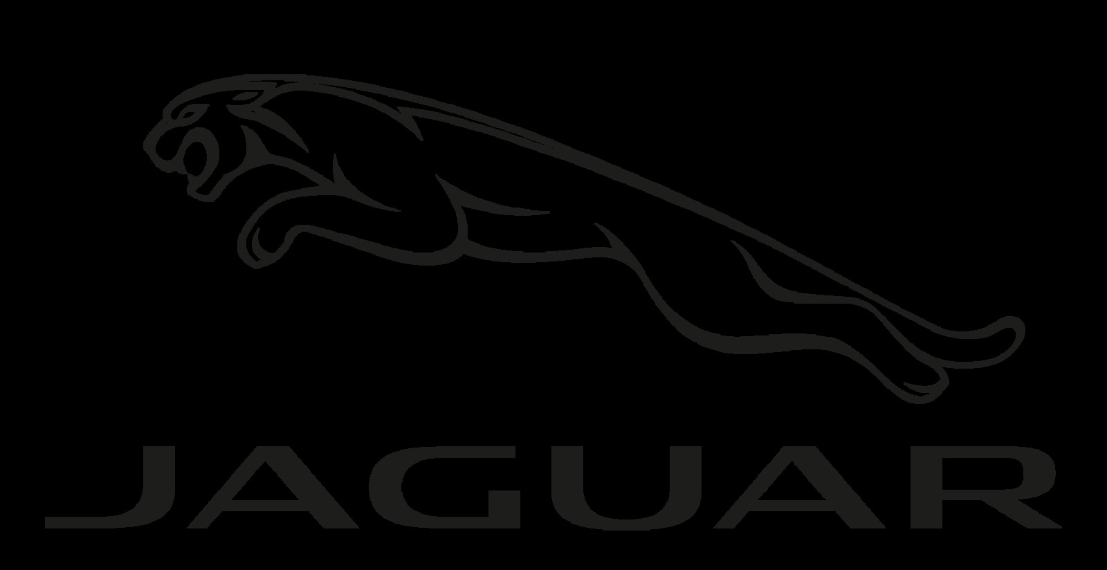
For decades, the Jaguar cars logo featured a leaping jaguar, embodying power, grace, and agility. This iconic image became synonymous with the brand’s commitment to high-performance vehicles and sophisticated design. The leaping jaguar was more than just a logo; it was a visual representation of the Jaguar driving experience. The previous wordmark, while perhaps dated, still conveyed a sense of classic elegance that resonated with the brand’s heritage.
The previous Jaguar logo, featuring the iconic leaping cat.
A Radical Departure: The New “Device Mark”
Jaguar’s rebranding introduced a minimalist wordmark, replacing the leaping jaguar with a stylized “JAGUAR” inscription. While the new logo aims for a modern and sleek aesthetic, it has been criticized for lacking the visual impact and brand recognition of its predecessor. The rounded, lowercase font feels more appropriate for a lifestyle brand than a luxury automaker competing with the likes of Rolls-Royce and Bentley.
Comparisons drawn between the new Jaguar logo and other brands.
The “maker’s mark,” a simplified leaping jaguar silhouette intended for use on grilles and other branding elements, fares slightly better. However, even this streamlined version lacks the dynamism and ferocity of the original leaper.
The new “maker’s mark” – a simplified leaping jaguar.
Lost in Translation: Brand Identity Crisis
Beyond the logo itself, Jaguar’s new brand identity campaign has drawn criticism for its derivative and uninspired visuals. The campaign’s attempt to project a bold and edgy image falls flat, relying on tired tropes and clichés that have been used countless times before. The “copy nothing” tagline feels ironic, given the campaign’s striking resemblance to past fashion and advertising trends.
Jaguar’s new brand campaign, criticized for being derivative.
A Missed Opportunity?
While Jaguar’s desire to modernize its image is understandable, the execution of the rebranding has been widely deemed a misstep. The new Jaguar cars logo lacks the distinctive character and immediate recognition of the iconic leaping jaguar. The brand identity campaign, rather than forging a new path, treads familiar ground, leaving many questioning the direction of the once-revered marque. The rebranding, intended to revitalize the brand, has instead sparked concerns about Jaguar’s future.
The Future of the Jaguar Cars Logo
The negative response to the new Jaguar cars logo raises questions about its long-term viability. Will Jaguar reconsider its rebranding strategy? Only time will tell. For now, the new logo serves as a cautionary tale about the importance of understanding brand heritage and the risks of sacrificing established identity for the sake of fleeting trends. The future of the Jaguar cars logo, and indeed the brand itself, remains to be seen.